Project Summary
Timeline
July 2020 – October 2020
Users
- Underhoused and other vulnerable clients within Alameda County
- Resource providers serving the Alameda County community
Stakeholders
- Human Services Dept., City of Oakland
- S. Digital Response
- County of Alameda
- Local Resource Providers
- Data Brokers
Product
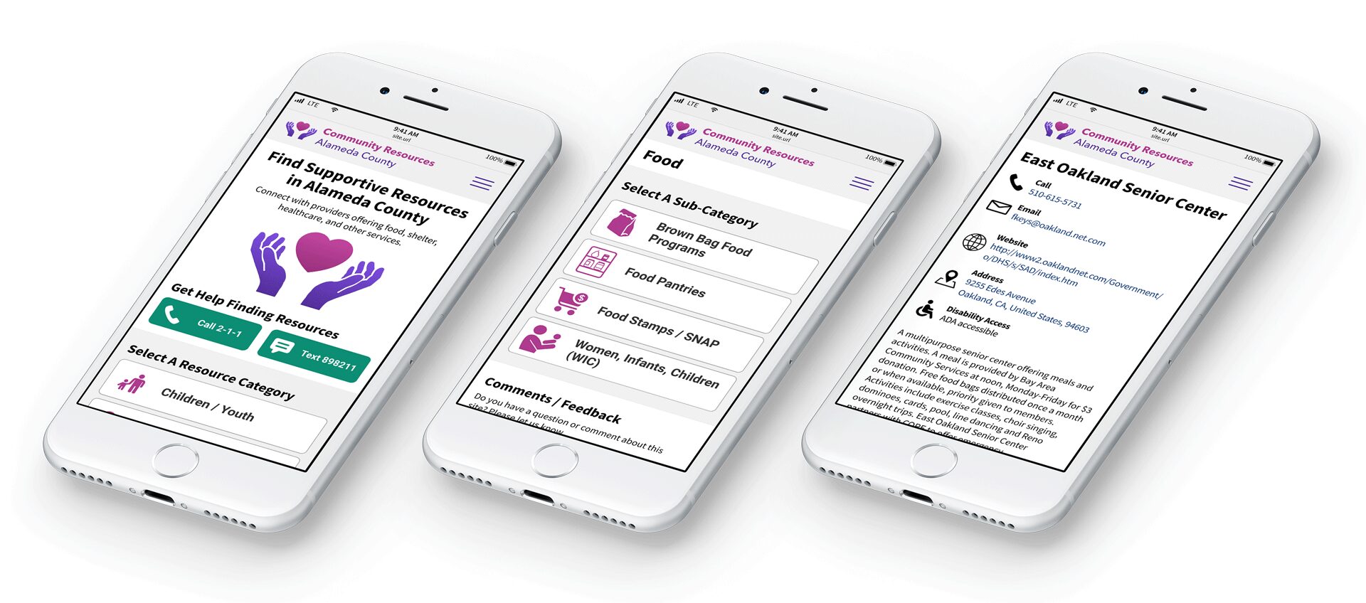
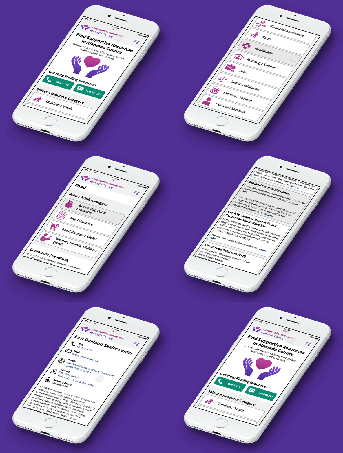
React-based, mobile-first, progressive web app for connecting vulnerable populations with available resources
Value of Product
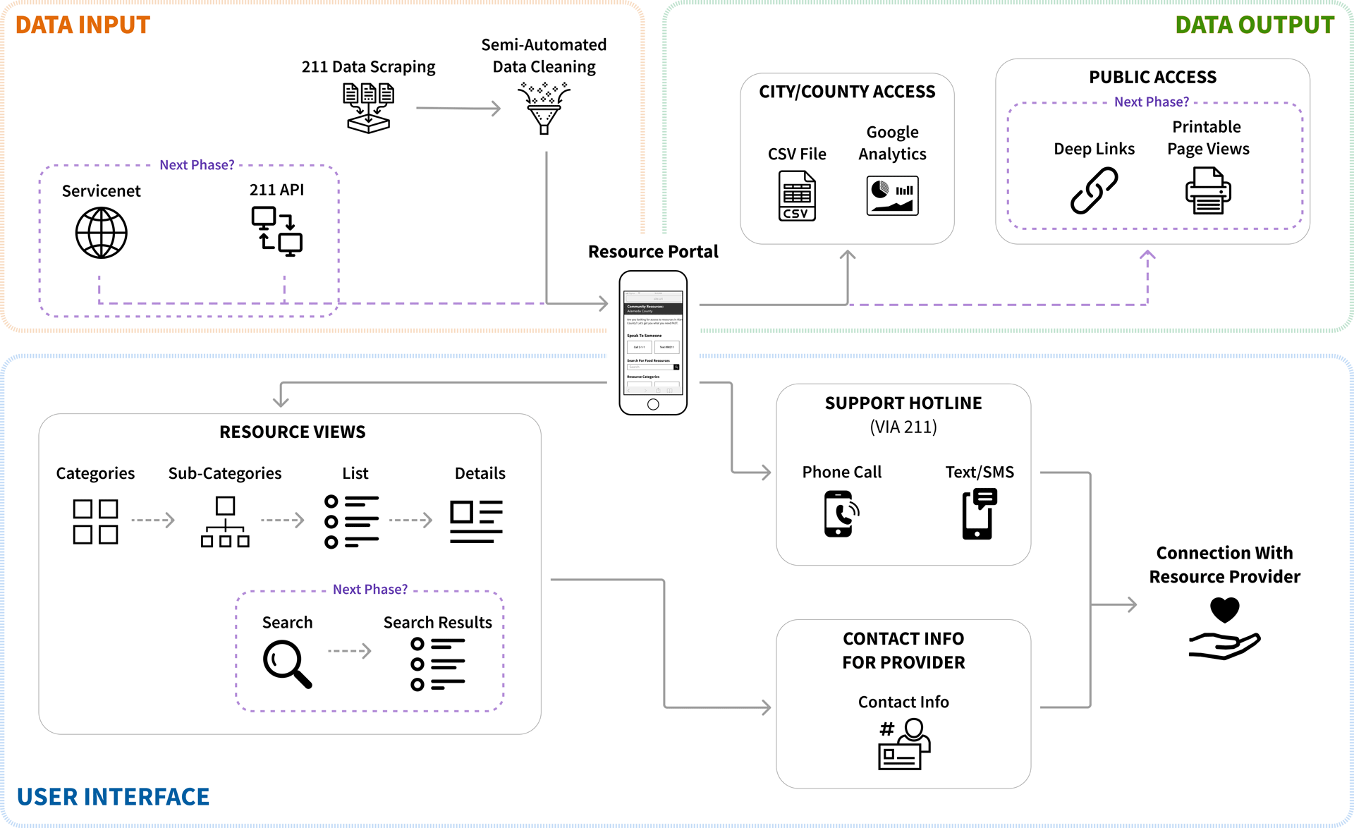
- Single touchpoint for numerous data sources
- Current data
- Simple interface
- Single tap phone calls to support networks
My Team
- Government liaison
- Front-End Developer
- Back-End Developer
- Project Manager (me, 2nd half)
- UX Designer & Researcher (me)
My Role
- UX design & strategy
- User research and testing
- Stakeholder management
- Project Manager (2nd half)
Value of My Contributions
- Identified key value opportunities for clients and providers
- Narrowed scope to focus on largest impact to be delivered in the least amount of time
- Refined initial engineering-led approach to better suit user needs
“Like Yelp, for supportive services”
Challenge: Connecting Resources To Those In Need
At the start of 2020 thousands of people in Alameda County we’re struggling with unmet needs (food, shelter, clothing, supportive services, etc.). When the pandemic hit a few months later this situation worsened considerably. This was especially true in the City of Oakland. Many resource providers within the County had aid to offer. However, there were numerous barriers keeping people in need from connecting with these available resources.
Remote means of communication had become all the more valuable in light of the need for social distancing. However, existing online sources of information were often inaccessible or too challenging for the end users they were designed to serve. Improvements in the accessibility and user experience of online resource information could help close the gap between available resources and those in need.
USDR Enlisted To Help
U.S. Digital Response (USDR) serves the immediate needs of the public by activating highly-skilled talent, leveraging new technology, and partnering directly with governments and nonprofits. The Human Services Department of Oakland, CA enlisted USDR to help connect the local vulnerable population with available resources. USDR formed a team which I joined a few weeks into the project.
U.S. Digital Response (USDR) serves the immediate needs of the public by activating highly-skilled talent, leveraging new technology, and partnering directly with governments and nonprofits. The Human Services Department of Oakland, CA enlisted USDR to help connect the local vulnerable population with available resources. USDR formed a team which I joined a few weeks into the project.
Process
Our team developed an understanding of the problem space through conversation with local resource providers. We learned about the wide range of barriers standing between a vulnerable individual and the support they need, the “support gap”. Our team identified opportunities to reduce some of these barriers through improvements in online communication of information related to supportive services and resources. The result was a progressive web app that leveraged existing resource data and presented it in an easy-to-navigate interface.
Provider Interviews
One of the first questions I asked when I joined this project was if we had spoken with resource providers or their clients. The team had not.
I drafted a research plan, solicited buy-in from our partners at the City of Oakland, and set up interviews with a handful of providers. We learned a lot!
Issues for End Users
In Scope
- Client unaware of resource
- Client fails to make contact with resource provider
Out of Scope
- Insufficient availability
- Ineligibility
- Communication failures
- Inaccurate information
- Application process too difficult, time consuming
Issues for Providers
In Scope
- Many clients are sheltering beyond physical reach of services
Out of Scope
- The resource information ecosystem is crowded and messy
- MANY databases, systems, processes, and tools
- Providers have zero bandwidth/interest in adopting new practices/tools without reducing workload elsewhere
- Providers primarily communicate with clients via offline methods
- Many clients do not have reliable access to internet
Project Opportunities
In Scope
- Population in need of resources has expanded during pandemic
- Online communication is preferable for some of those in need
- Current online portals are difficult for clients to navigate
Out of Scope
- Ad-hoc, paper-based databases created by providers
- Capacity info is unavailable / hard to find
- Resource eligibility is especially challenging for clients to navigate
Existing Solution – 211
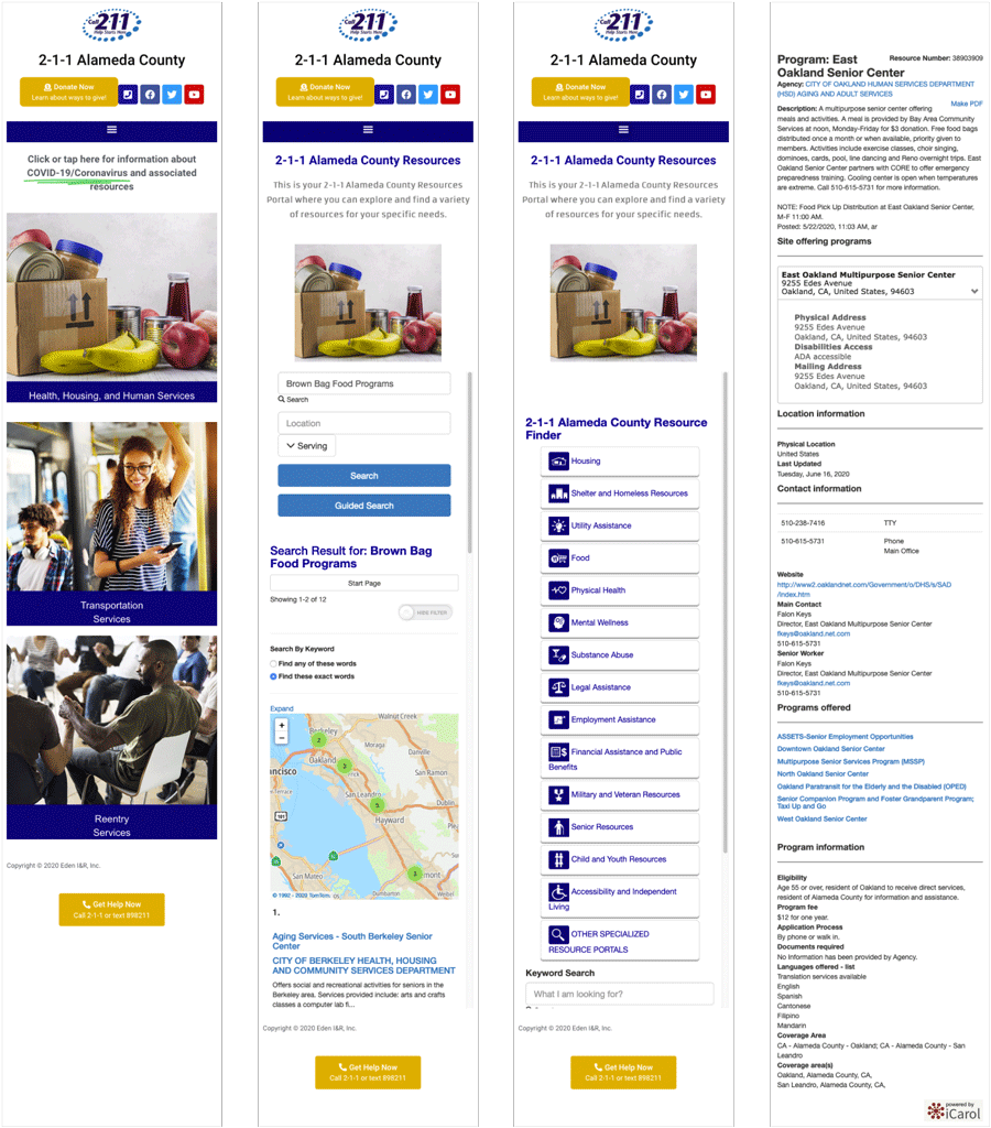
According to local providers, 211 (https://211alamedacounty.org/) was the “go to” website for resource info. Our team performed a thorough investigation. One of the key values of 211 was that it served as an aggregator of resource data across the majority of providers in the area. This made it especially useful for the providers themselves as it could give them an accurate picture of resources beyond their own to which they could refer people.
One of the main challenges with 211 was that it only worked well for those already familiar with its labyrinthine architecture and who were accessing the site from a desktop computer. The mobile usability of the site left a lot to be desired, even if you knew what you were looking for, and many of those in need had neither the familiarity nor reliable access to a full computer. This presented an opportunity for our team.
Opportunities for Improvement
- Mobile optimization
- Accessibility
- Ease-of-use
- Navigation and data architecture
- Search
- Call / SMS shortcuts
Data Mapping
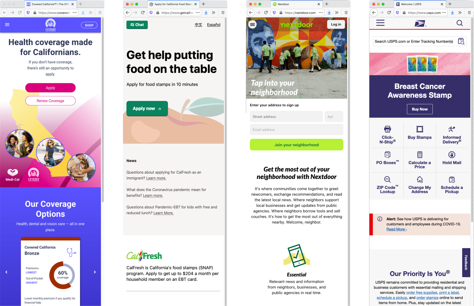
Inspiration
Iconography
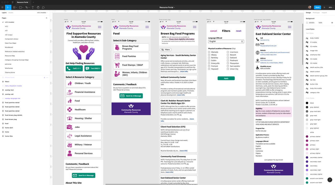
Figma Prototype
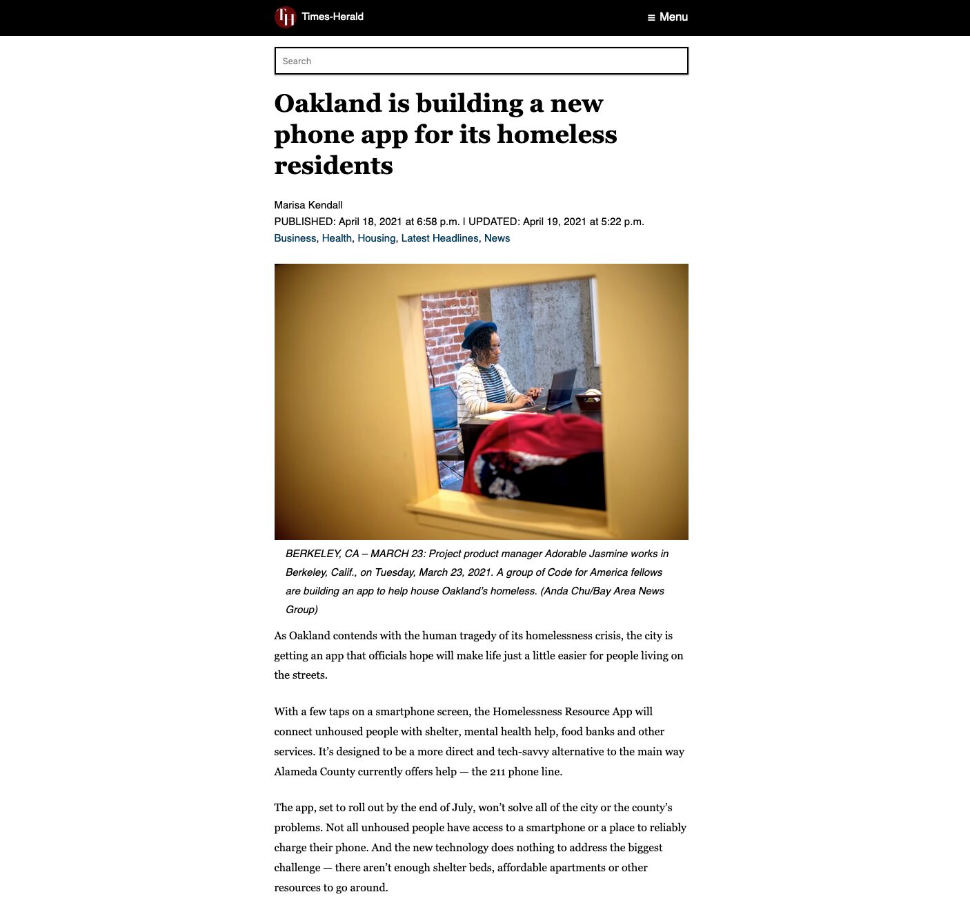
Project Completion & Handoff
USDR typically structures their projects to be short-term engagements in the 3-6 month range. Luckily the City of Oakland already had an agreement in place with Code for America (CfA) to provide work on a yet-to-be defined project with the Human Services Department. Our contacts in the department felt that the Resource Portal was a perfect fit. So, with the support of our partners, we handed the project off to the CfA team.
